- Featured Maps
- January 25, 2022
More Than Digital Copies: Maps That Interpret Maps
When we digitize historical maps we create copies that can be shared and used by all. But we also create the potential to repurpose these copies to advance understanding of the original maps. To do this, we create composite maps, georeferenced maps, composite views, interactive globes, composite texts and other types of digital versions that expand map interpretation and enhance use. Below are some examples of these interpretive maps that we have created over the past 20 years. To date we have created 1,674 interpretive composite maps, views, and texts as well as over 56,000 georeferenced maps.
Click on any of the images below to view the interactive online version.
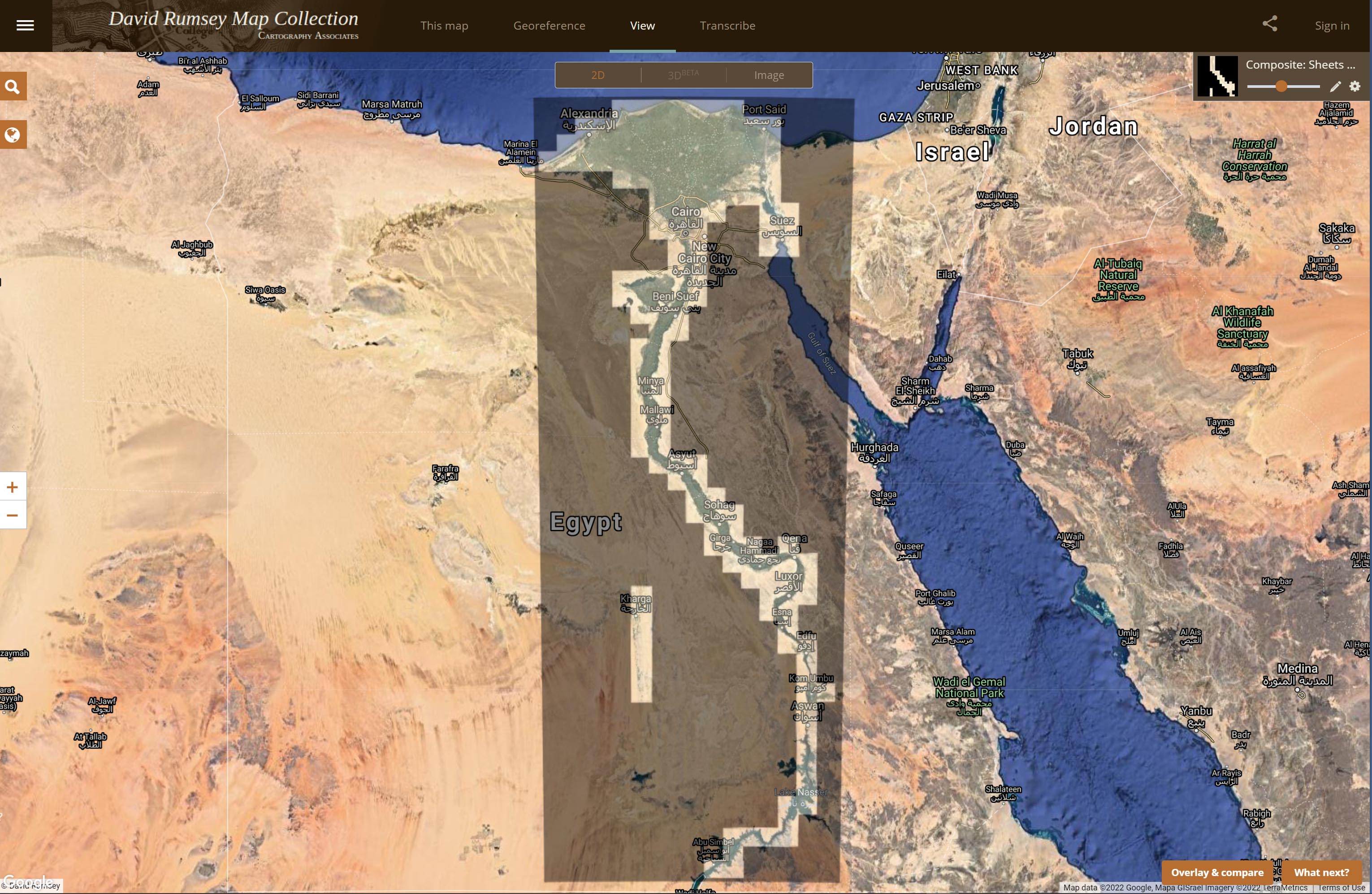
The 1914 Atlas of Egypt shows the entire Nile River in 165 sheets at a large scale of 1:50,000. We combined all 165 sheets, georeferenced them, and overlaid them on modern maps below to show changes.
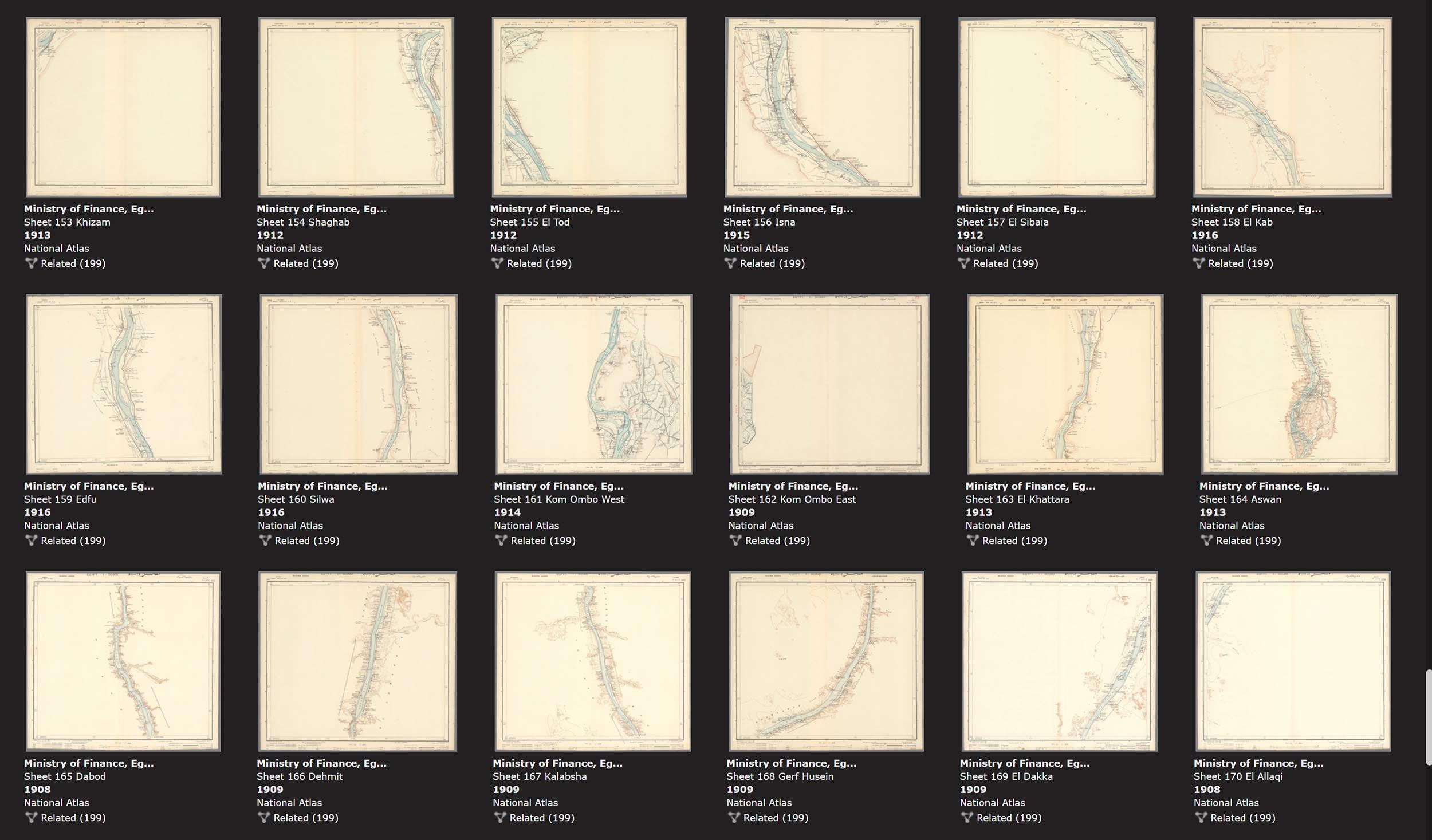
The 165 separate sheets of the 1914 Atlas of Egypt
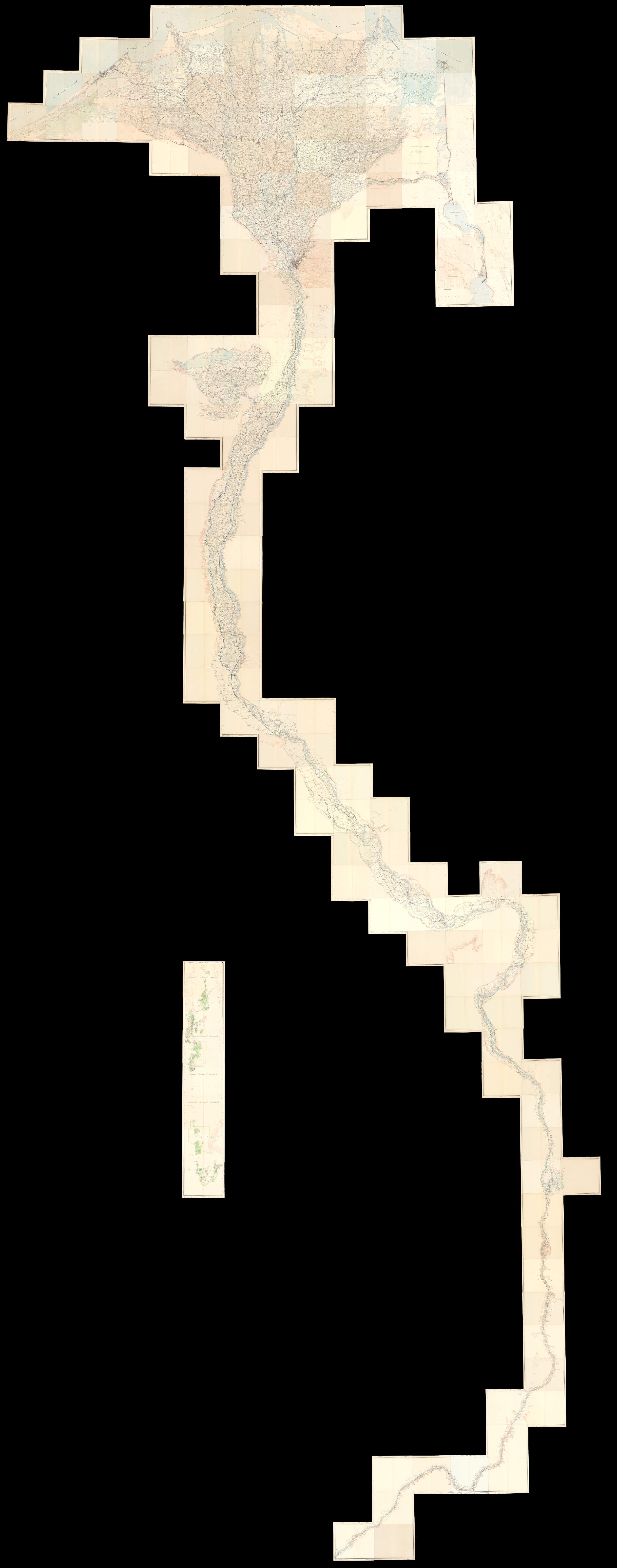
All 165 sheets of the Atlas of Egypt joined. The joined sheets give a complete view of the Nile and its huge delta.
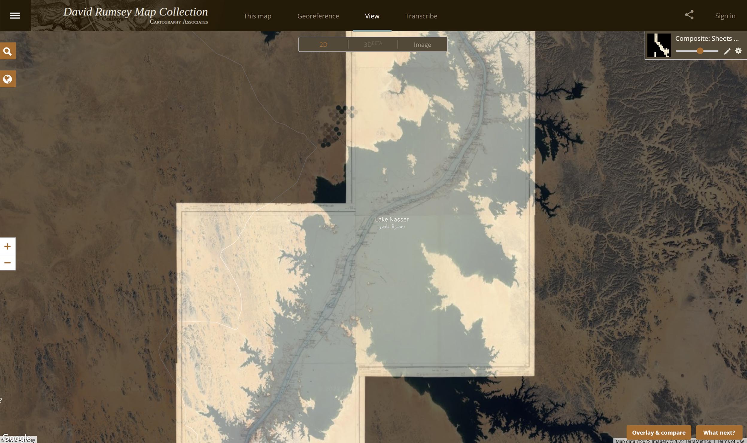
Detail of the Atlas of Egypt sheets showing the original Nile river course underneath Lake Nasser.
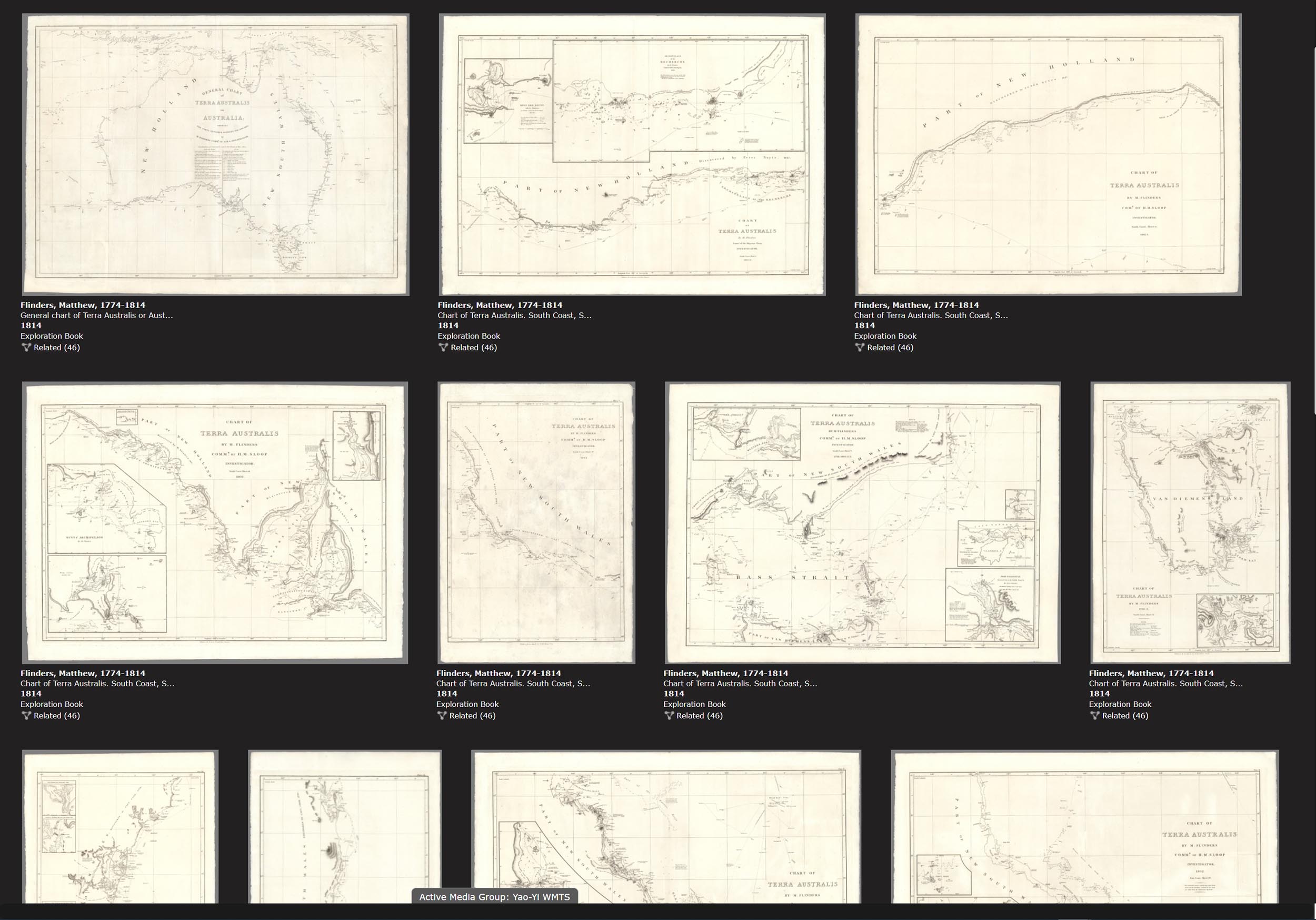
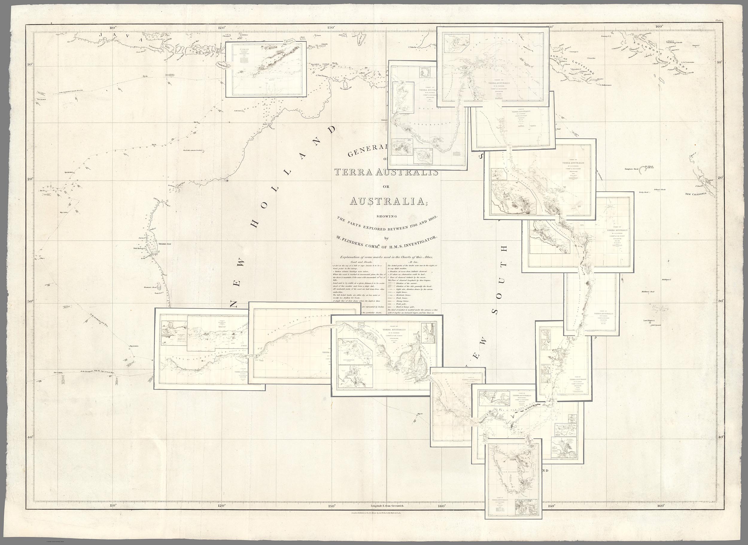
Matthew Flinders' 16 charts published in 1814 were among the first to map the coast line of Australia.
Here the 16 Flinders Australia charts are joined and overlaid on the general chart to show how all the charts fit together.
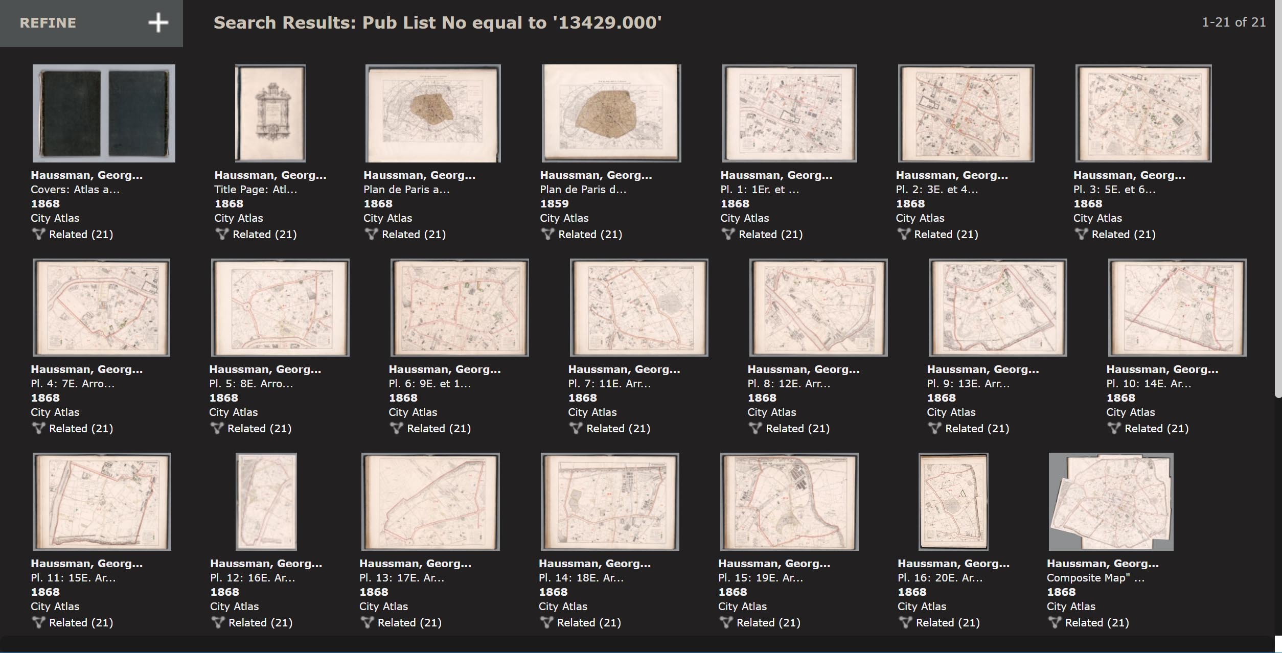
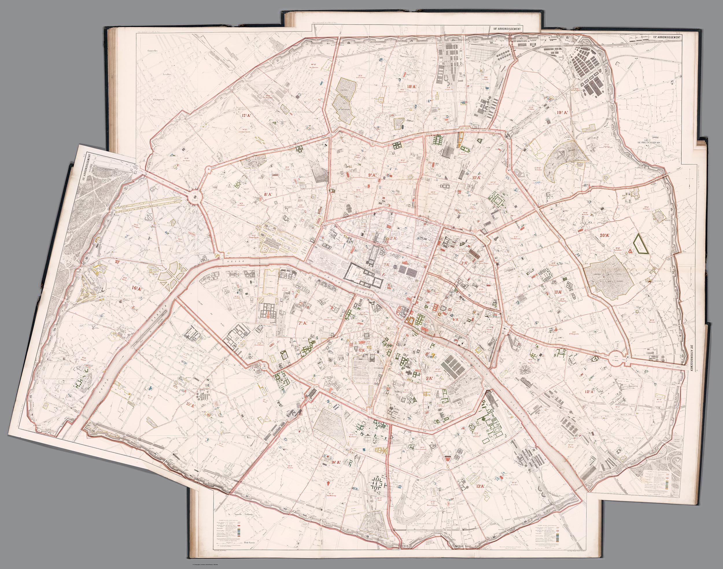
Baron Haussmann published these 16 separate maps of Paris in 1868 to show his proposed new boulevards that would transform Paris into a modern metropolis.
This new map image joins all 16 separate sheets of Paris to show the entire city as one map. It gives a much better picture of Haussmann's changes than the separate maps do by themselves.
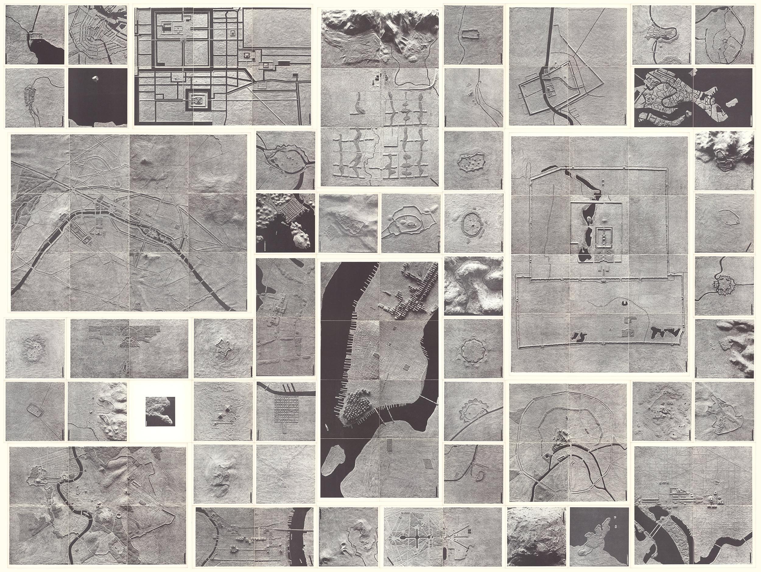
Architect and data visualizer Richard Saul Wurman in 1963 created with his students a book - The City, Form and Intent - with images that enable comparison of 50 cities in different parts of the world at the same scale, 1:14,400. This composite map below shows all 50 cities at the same scale in one image.
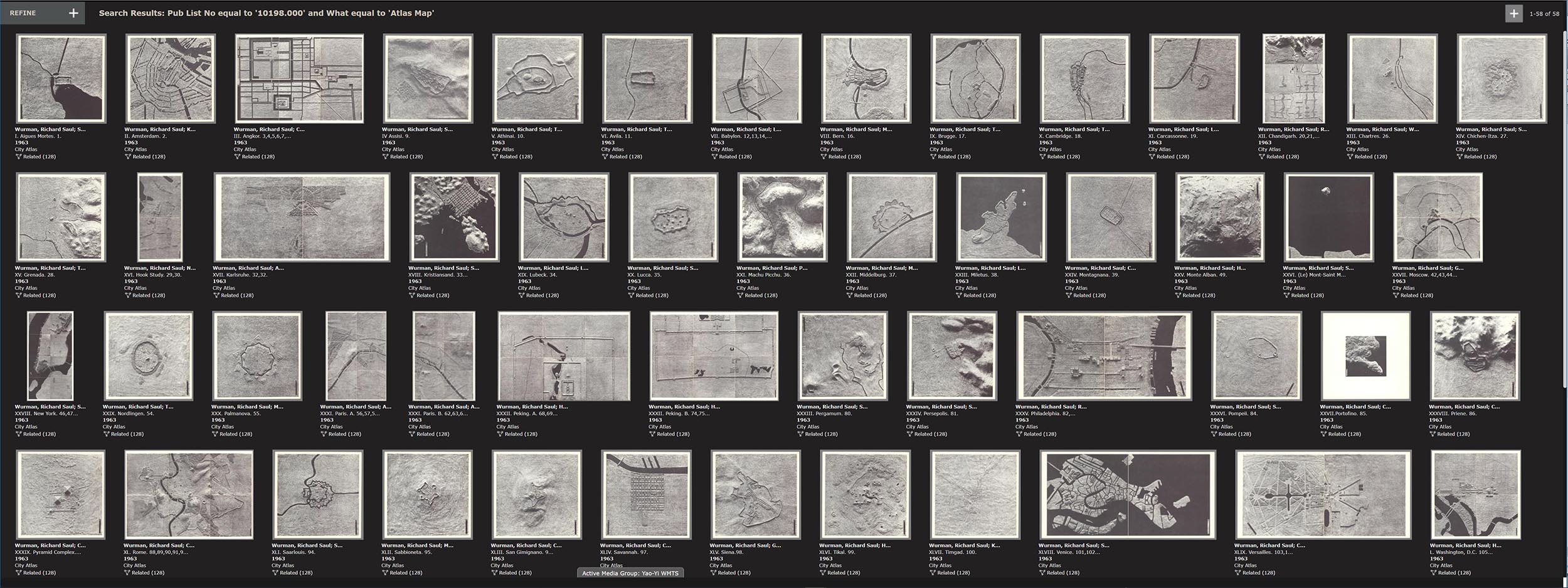
Below are the separate images of the 50 cities that are not able to show relative size because of the digital display system - digital images tend to all look the same size.
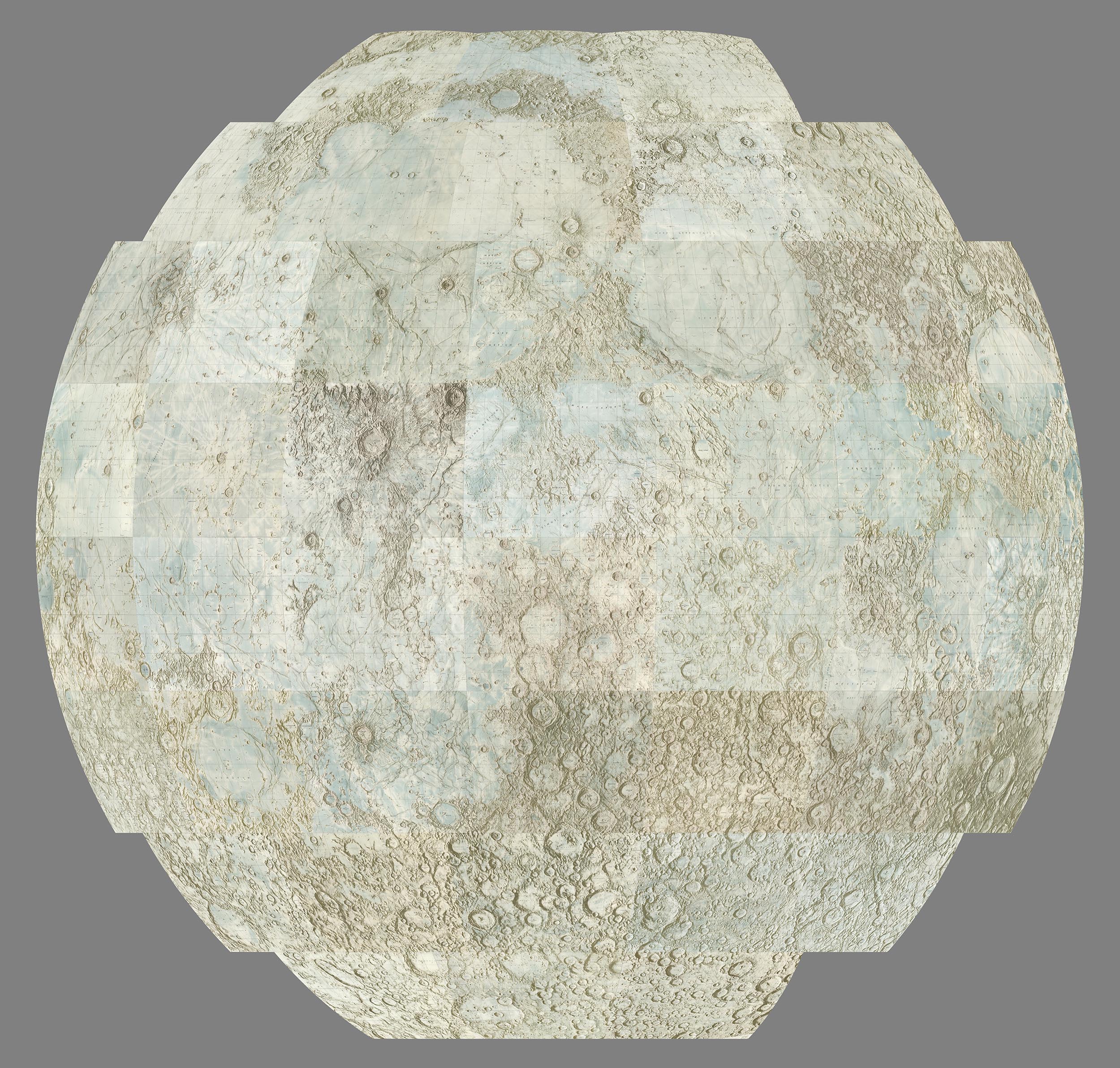
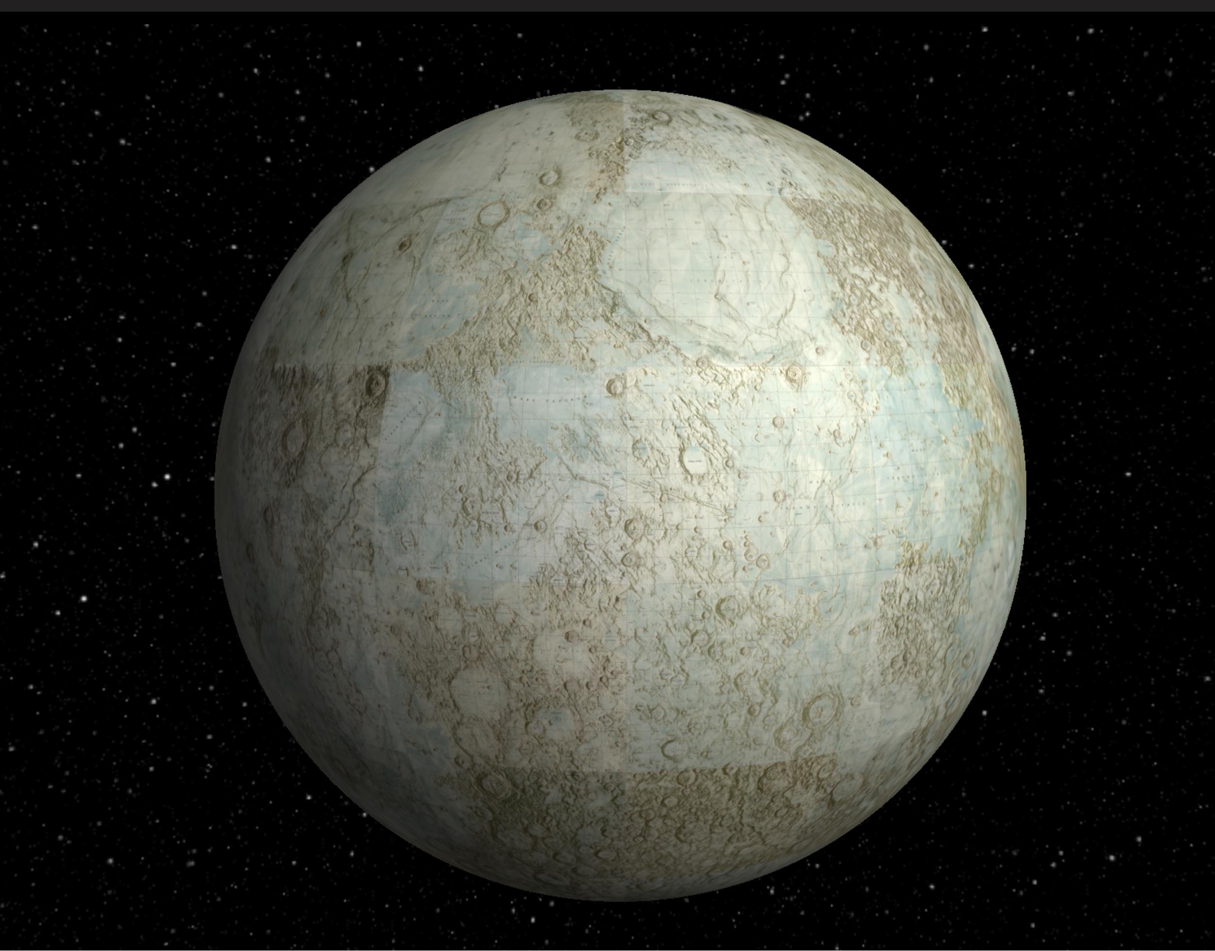
The United States Air Force and NASA produced 44 maps of the moon in the early 1960's that combined earth-based telescope observations with existing photographs, adding lunar features artistically drawn and airbrushed with India ink. All 44 maps in the series were joined using GIS to georeference them in their native projections, Lambert Conformal for the top and bottom 3 rows and Mercator for the 2 middle rows north and south of the equator. Then the joined images can be reprojected as below into a single orthographic projection.
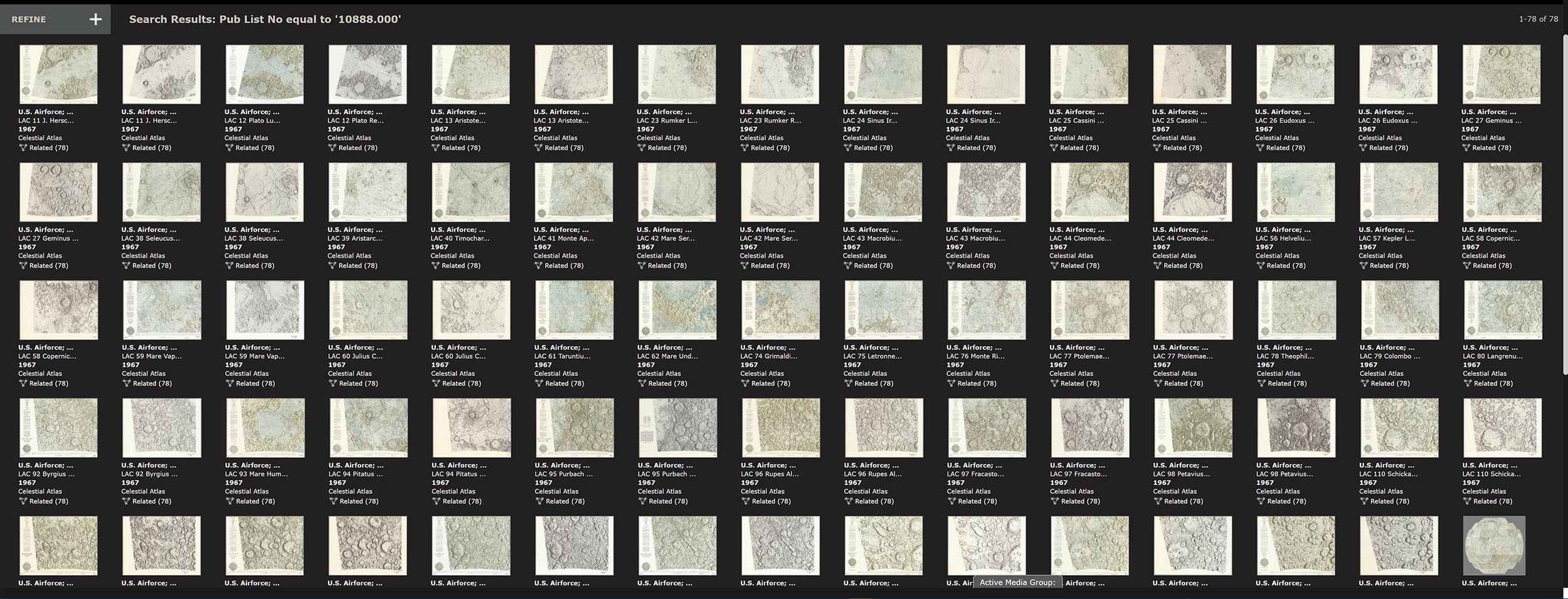
The 44 United States Air Force and NASA separate maps of the moon are below.
An interactive three dimensional globe has been created from the 44 georeferenced moon map images.
Clarence King and his 40th Parallel Survey of 1876 made 5 maps showing a broad cross section of the American West, something not attempted before. Joining the 5 maps together digitally enables a much better understanding of the importance of the work. Below is the set of 5 geologically colored maps.
Below are the same 1876 King Survey maps showing only the topography.
5 separate sheets that when joined below create a 360 degree view of Santiago, Chile, in 1823.
Here the sheets are joined together which enables a complete comprehension of the artist's intent.
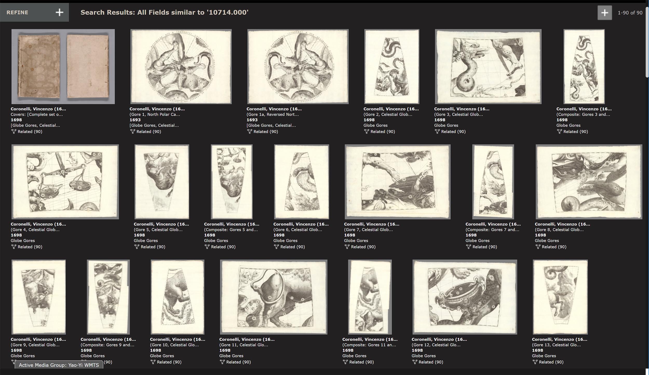
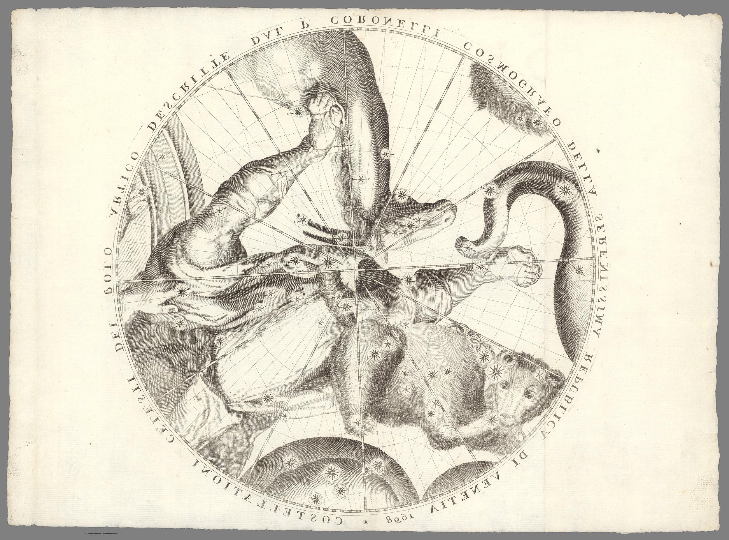
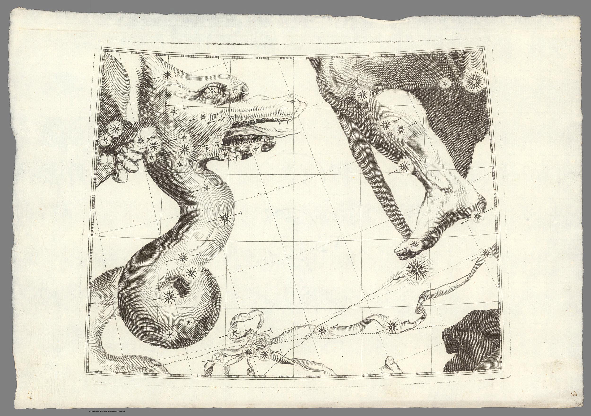
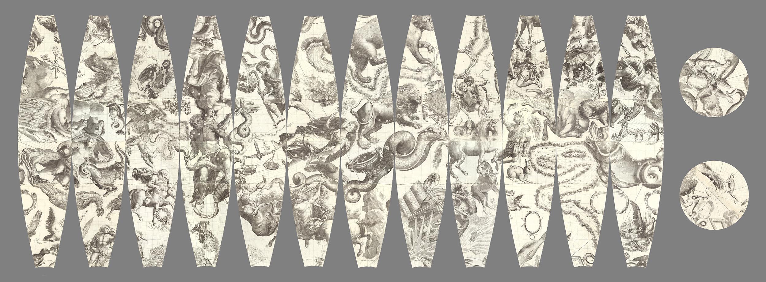
In 1698 Italian map and globe maker Vincenzo Coronelli created an unusual globe of the heavens that was meant to be seen from inside the globe, not from the outside as most celestial globes were made then. He made reverse or counterproof versions of his celestial globe gores for his 1 meter globe to accomplish this. The gores are shown below.
This is the north polar calotte globe gore that covered the top of the globe.
This is a typical globe gore
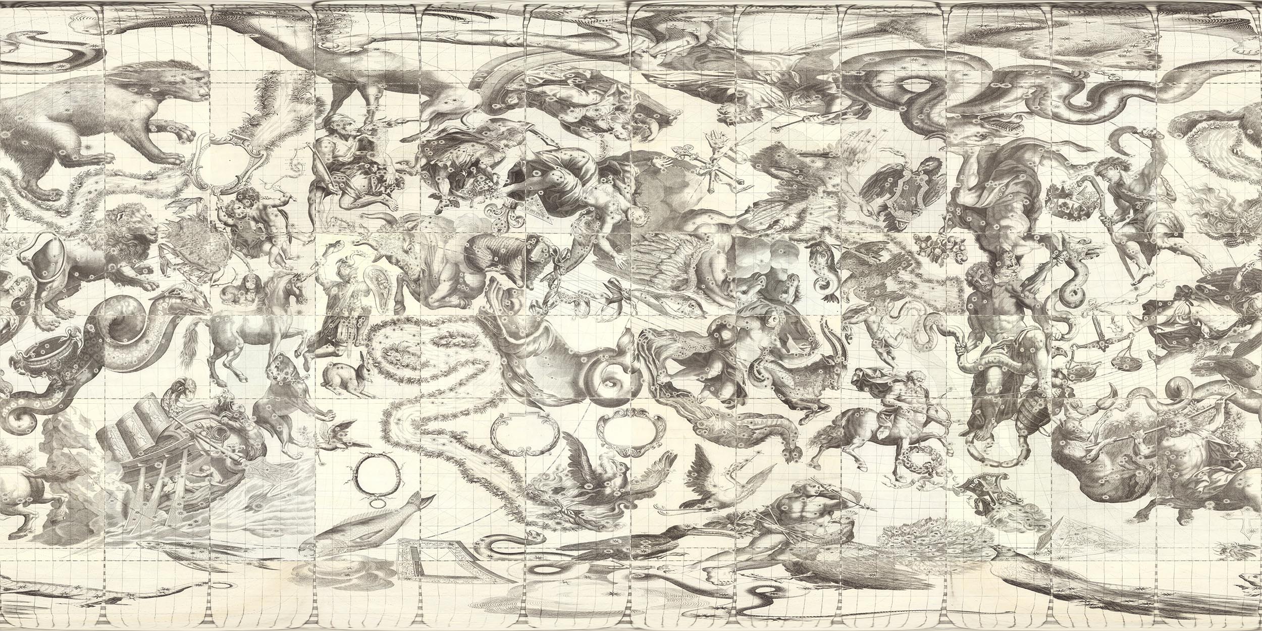
Here the 44 globe gores and the north and south polar calottes are joined together using a combination of georeferencing to join the 4 gore parts into single gores and photoshop to create the joining of all 12 complete gores and the calottes.
All gores and calottes are joined together using GIS to create a continuous image that can be projected onto the inside of a globe giving a geocentric view of the heavens. Click on the image to see the interactive interior globe.
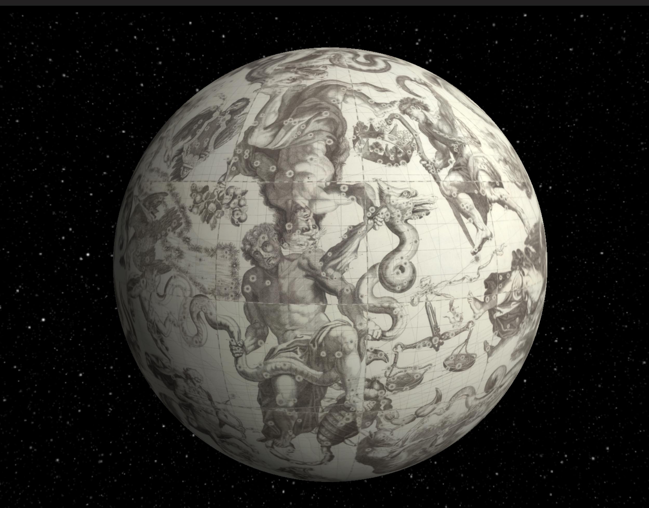
This is the more typical version of the celestial globe as seen from the outside or God's eye view.
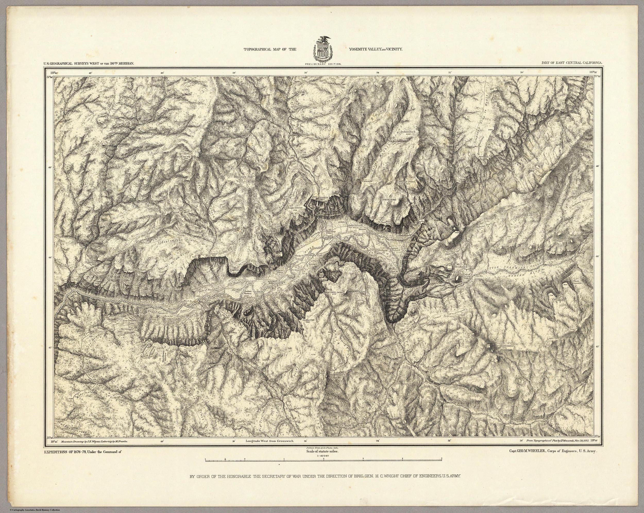
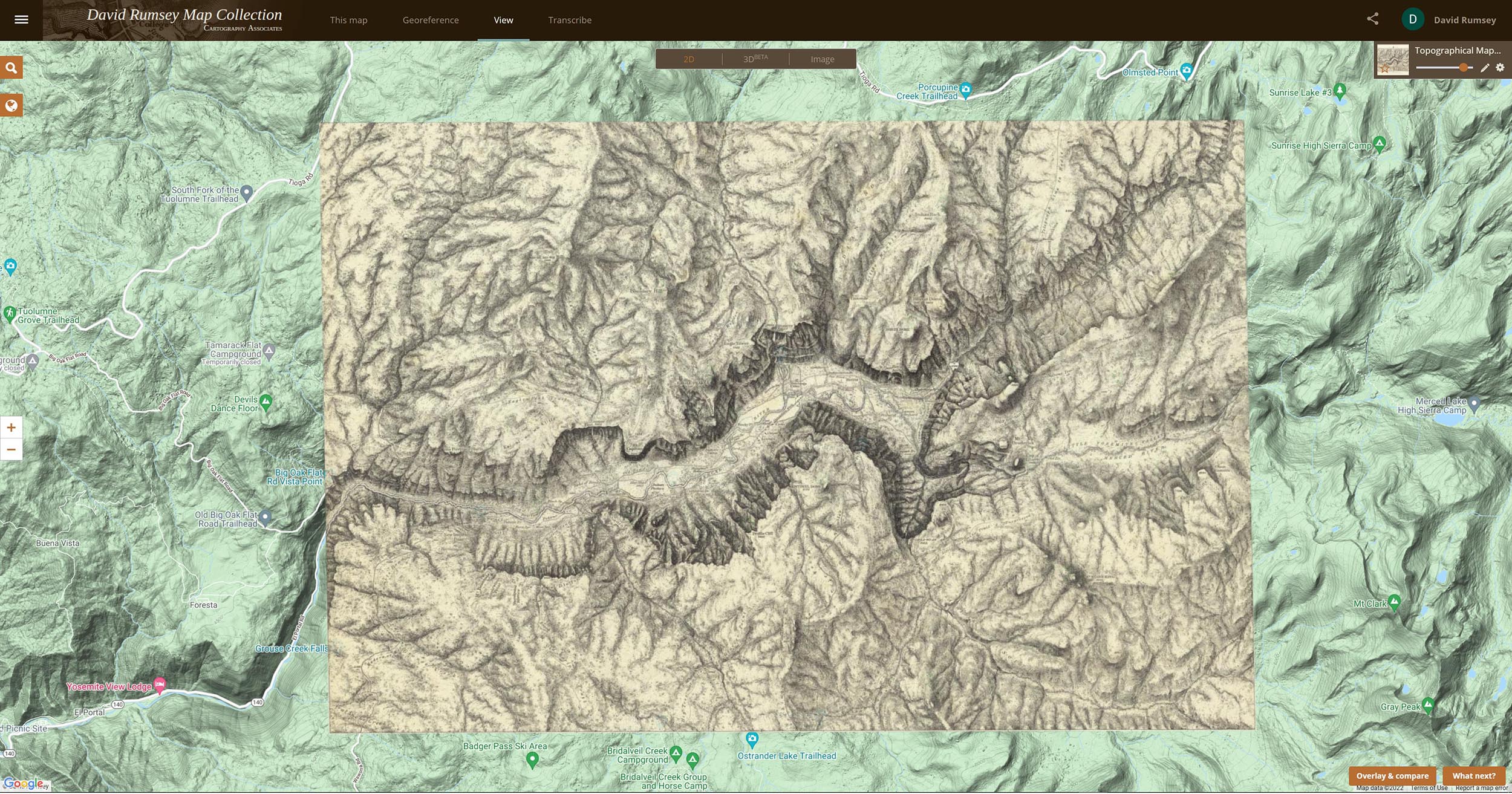
This is a Map of Yosemite Valley made in 1883 by the Wheeler Survey. It was the first accurate map of the valley made by trigonometric survey.
Here the map has been georeferenced in our online georeferencer tool and can be compared to the modern topographic map of the valley to see changes over time. Click on the map to see the live version with the transparency slider in the upper right.
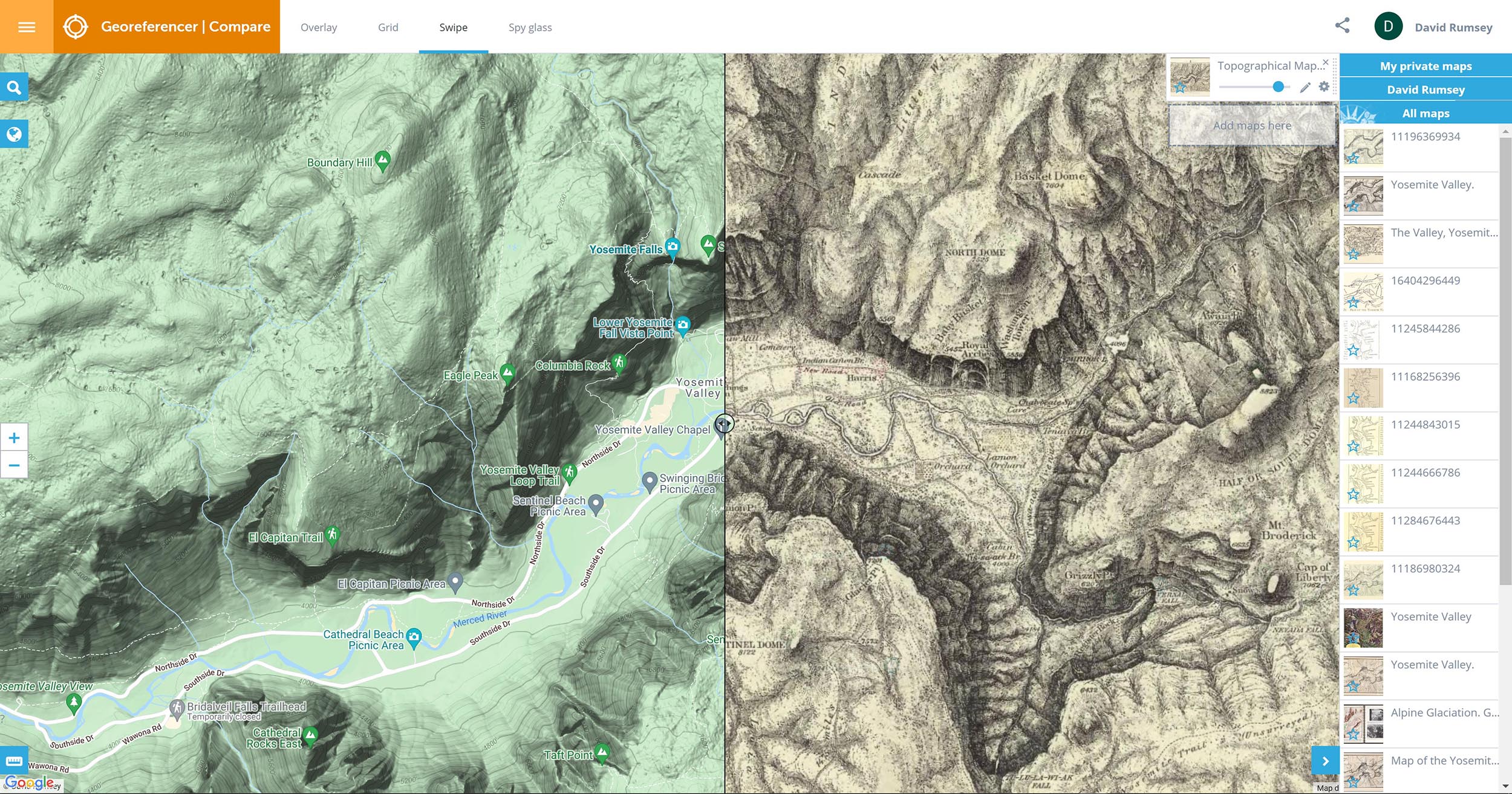
The Georeferencer Compare page below shows a Swipe view of two maps of the Yosemite Map - the present day map and the 1883 map. Click on the image to go to the Compare page Swipe view in Georeferencer for this map:
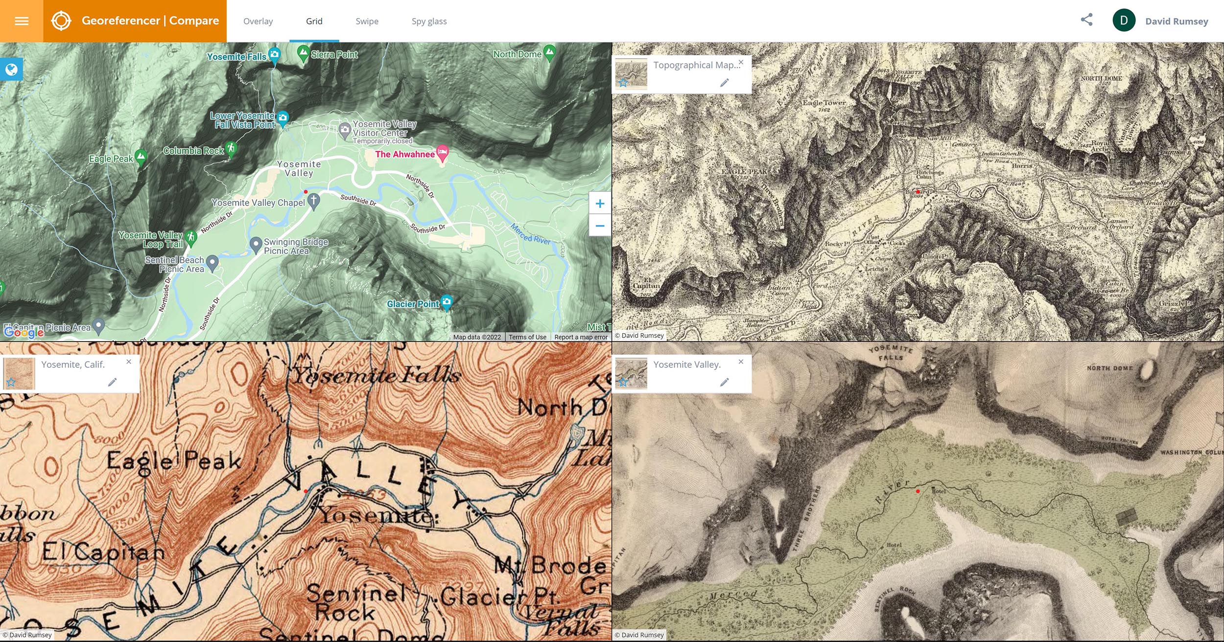
The Georeferencer Compare page below shows a Grid view of four maps of the Yosemite Valley made at different times from the present back to 1868. Click on the image to go to the Compare page Grid view in Georeferencer for this map:
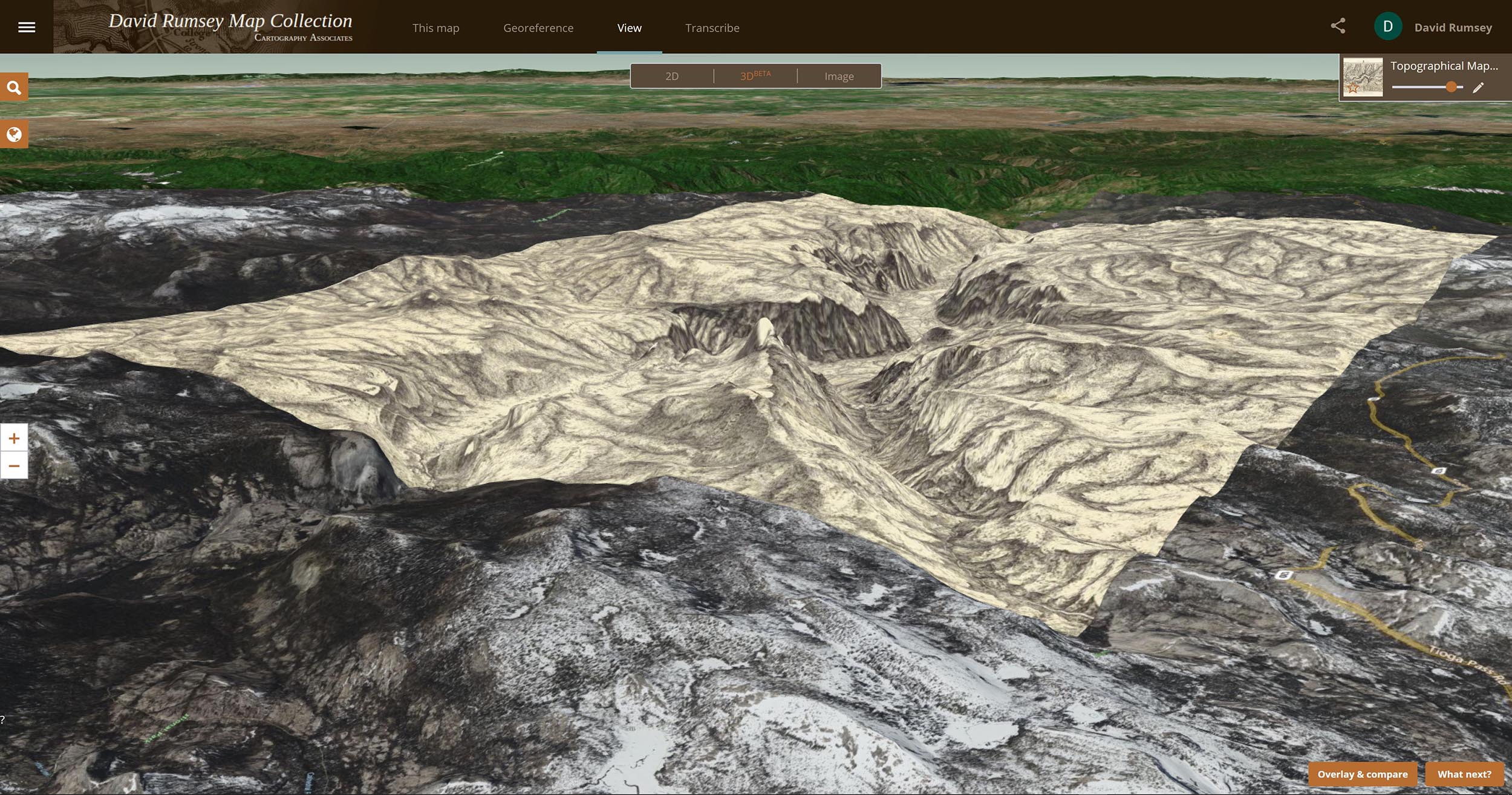
The Georeferencer Compare page below shows a 3D view of the Yosemite Map. Click on the image to go to the 3D view in Georeferencer for this map (requires sign in to a free account):
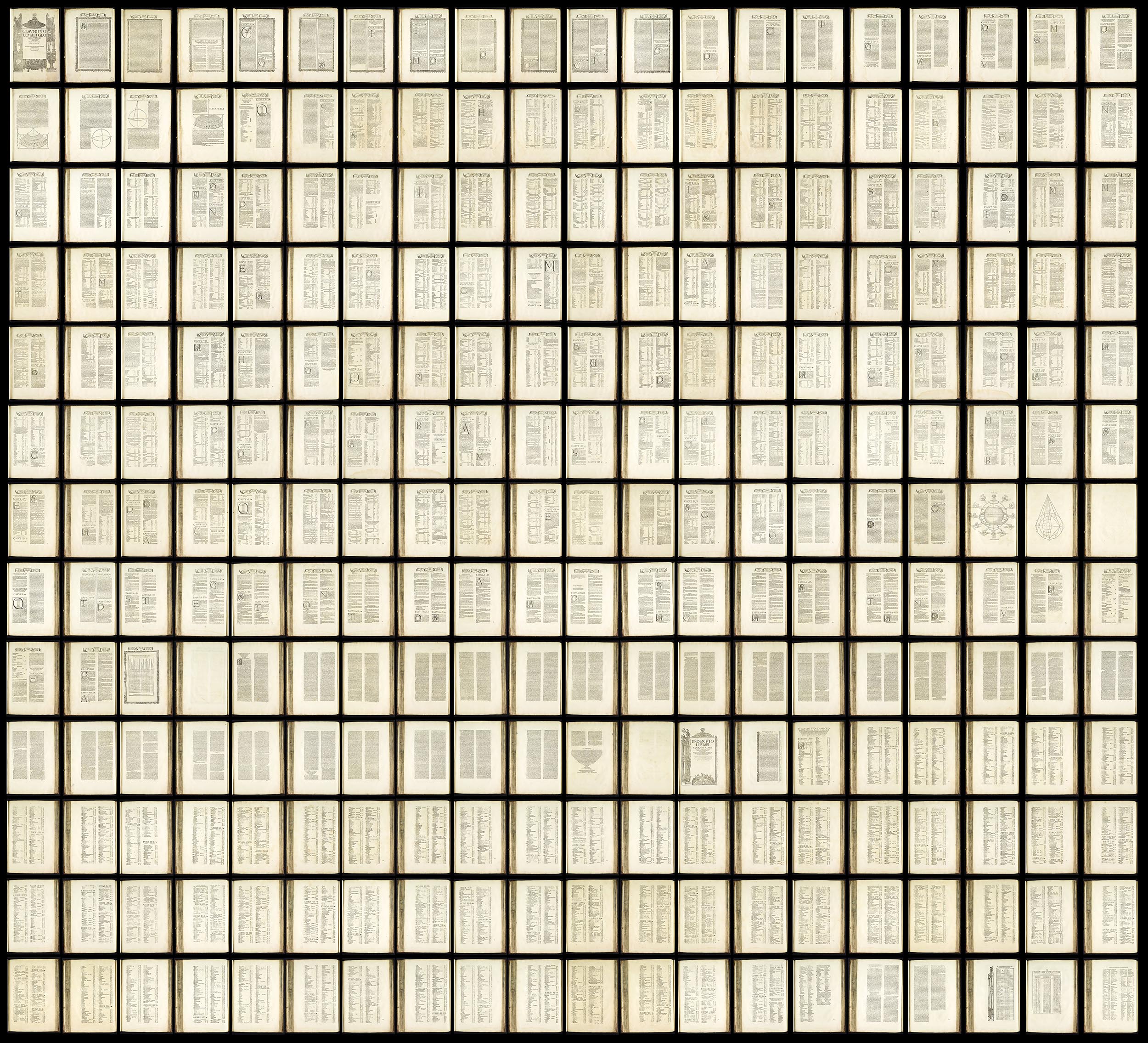
This is a text composite of all the text pages in the 1525 Strassburg edition of Ptolemy's Geographica. The 259 pages plus title page read left to right then down. The composite text image allows for smooth reading of the text, can be OCR enabled, and gives an overview of the entire corpus of text. Click on the image to read the text.
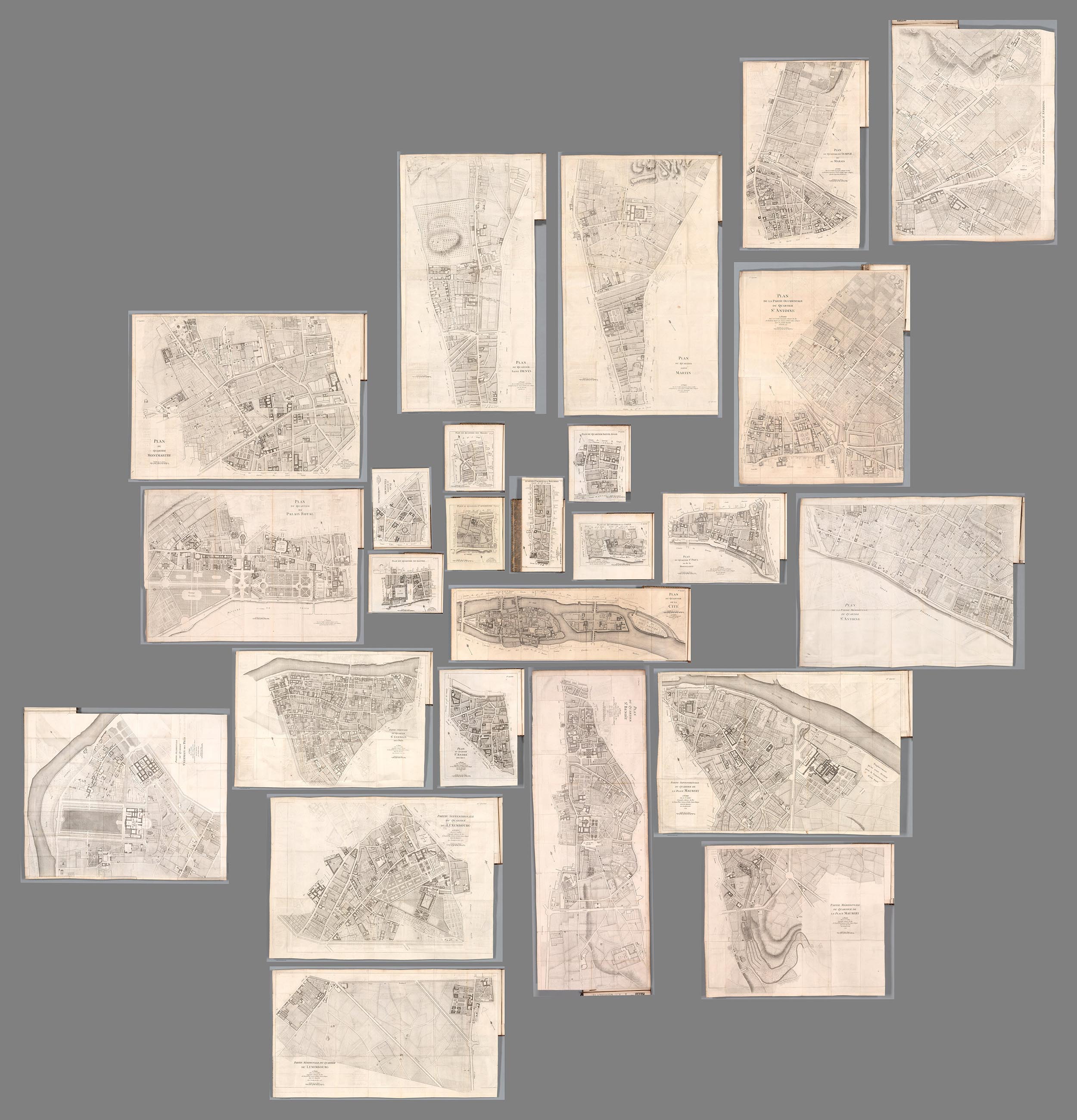
In 1775 Jean Baptise Michel Jaillot published his history of Paris - Recherches Critiques, Historiques et Topographiques Sur La Ville de Paris. The 7 volumes included 25 detailed maps of the city. In 1777 and 1778 Jaillot combined the 25 sheets to make one large map of Paris. This composite shows the rough positions of all 25 maps of Paris neighborhoods and illustrates the complexity of joining them all together to make one map. Jaillot added various infill map sections at the edges and the decorative border to make the full map.
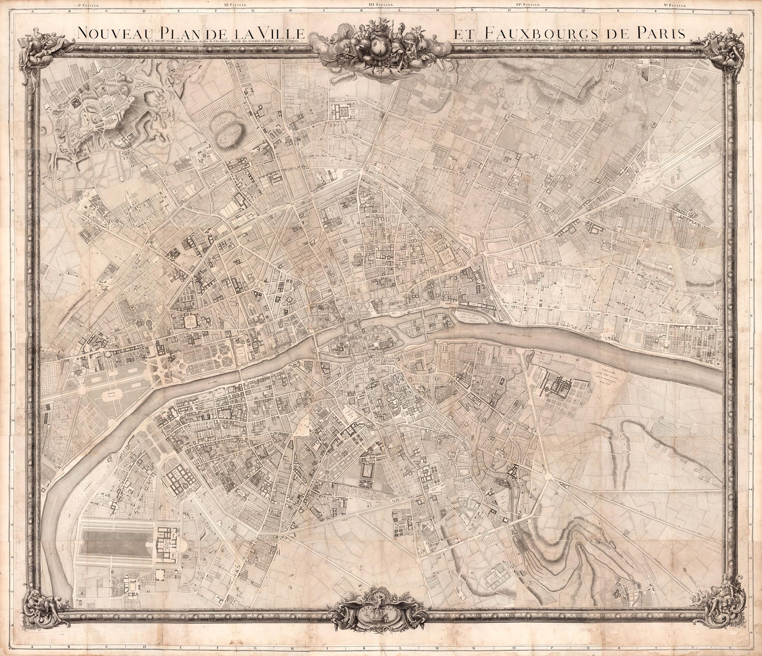
This is the map that Jaillot made from all the 25 parts plus infill sections. In the history of Paris mapping, usually map makers would make the full map first and then create smaller parts from it for other purposes but Jaillot did it the other way round. If you look closely at this map below you will see the section lines where he joined the 25 separate maps.
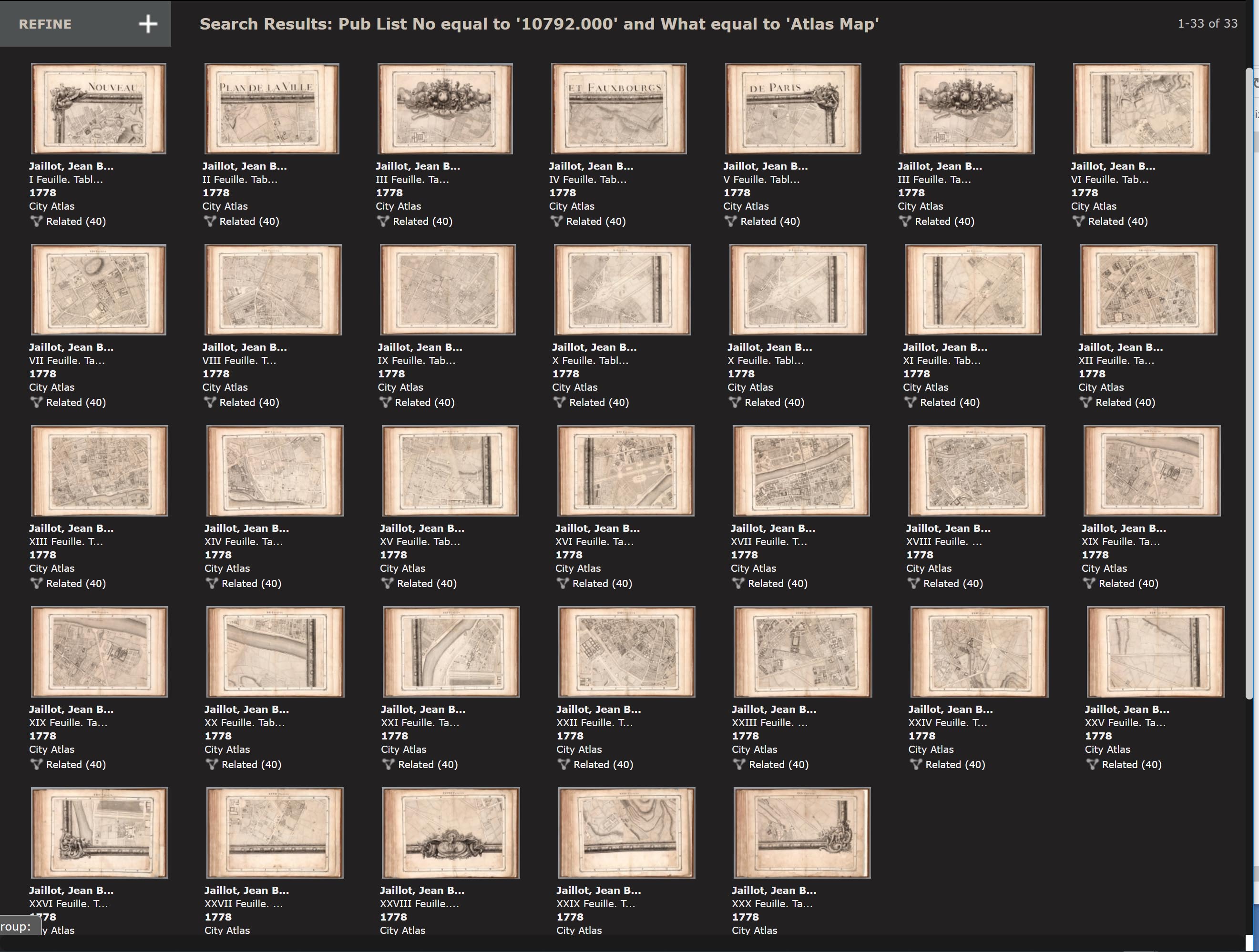
Apparently demand for Jaillot's large map was not what he expected so he decided to create a 30 sheet Atlas of Paris volume in 1778 by cutting the large map into 30 book sized sections and adding a title page, index and binding. So he had come full circle from his original 25 separate maps of Paris for his history.
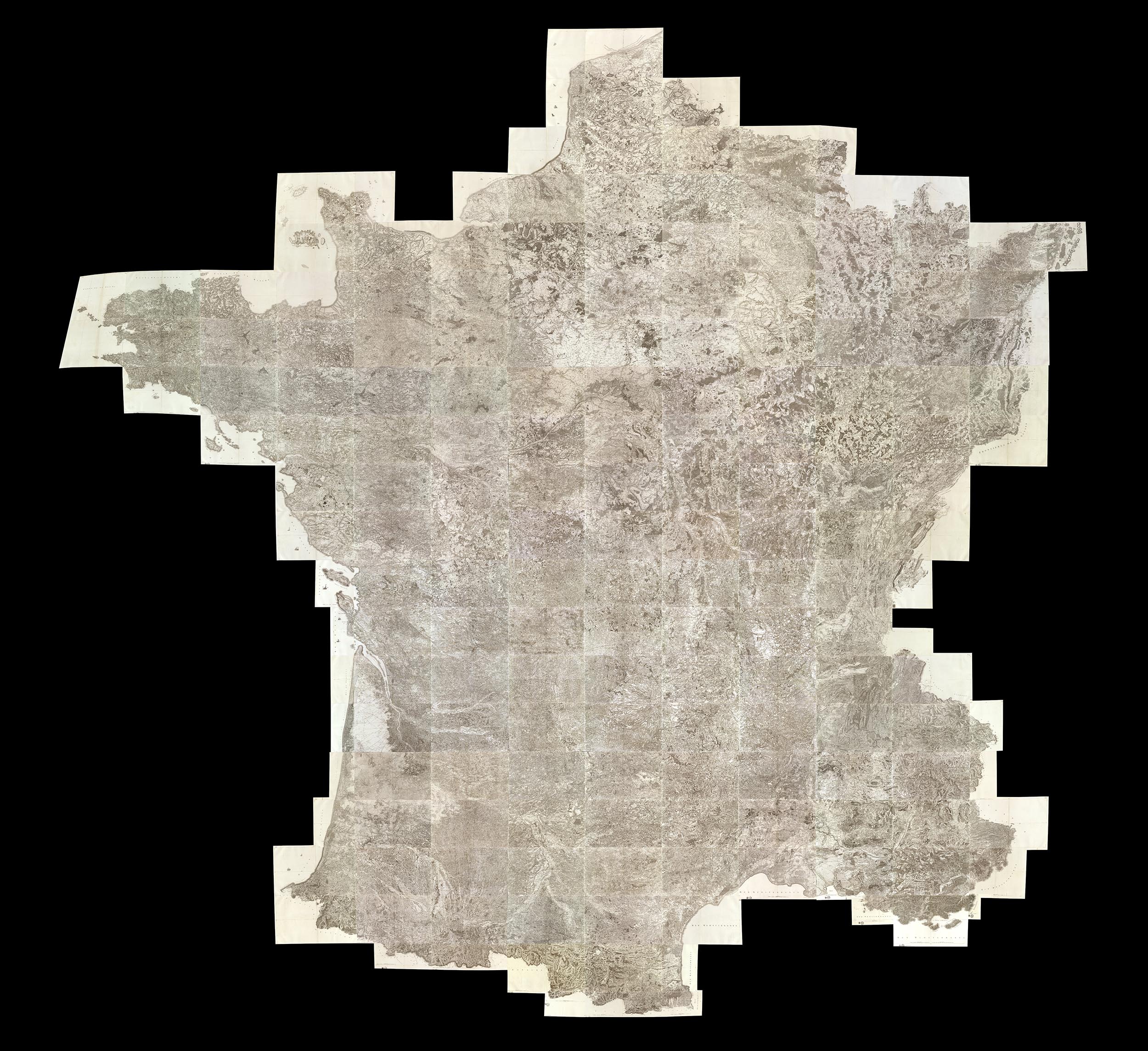
This large map of France made from 182 sheets of the 1750-1818 Cassini survey gives a view of the country at multiples scales that are not possible with the individual maps unless one tried to join them physically which would result in a map 40 feet square. This composite map is a dramatic example of the interpretation made possible through the use of derivative maps like this. Georeferencing this map, which we have done, also allows further mining of the map data to show changes over time.
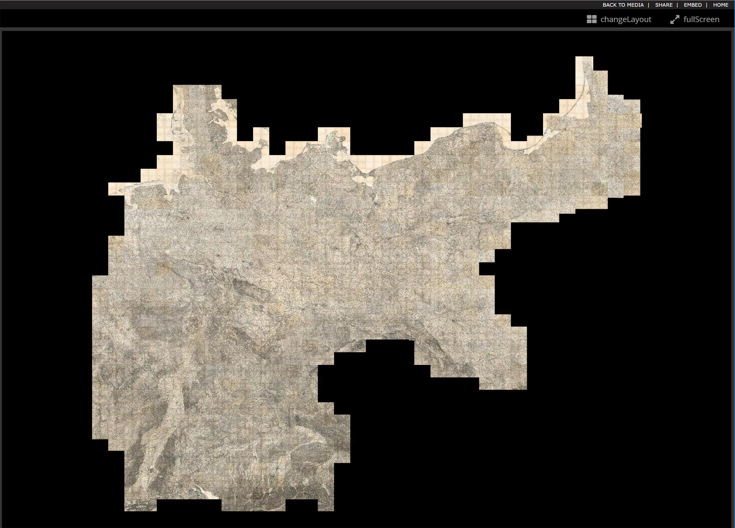
Our largest composite map is this 674 sheet assemblage of the Karte des Deutschen Reiches - the 1893 survey of Germany at a scale of 1:100,000. Like the Cassini France composite, we also georeferenced this map, in fact the map was built in GIS layers as it proved too large for photoshop to create.
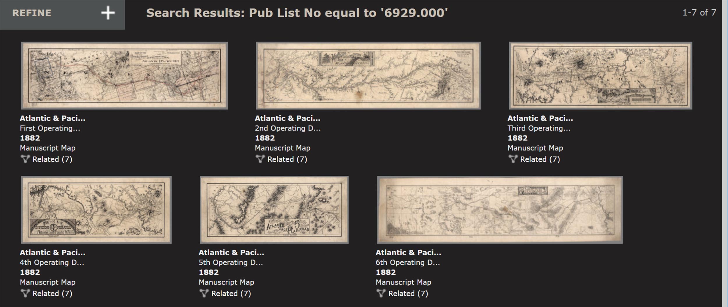
A more modest composite map but equally interesting is this 6 sheet manuscript map made by the First Operating Division of the Western Division, Atlantic & Pacific R.R. (Railroad) in 1882. The survey runs from Albuquerque, New Mexico to Mojave, California.
The composite map below vividly shows the unusual orientation of the sheets as they proceed east to west.
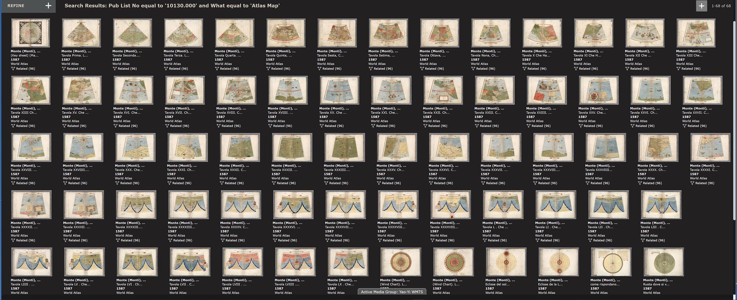
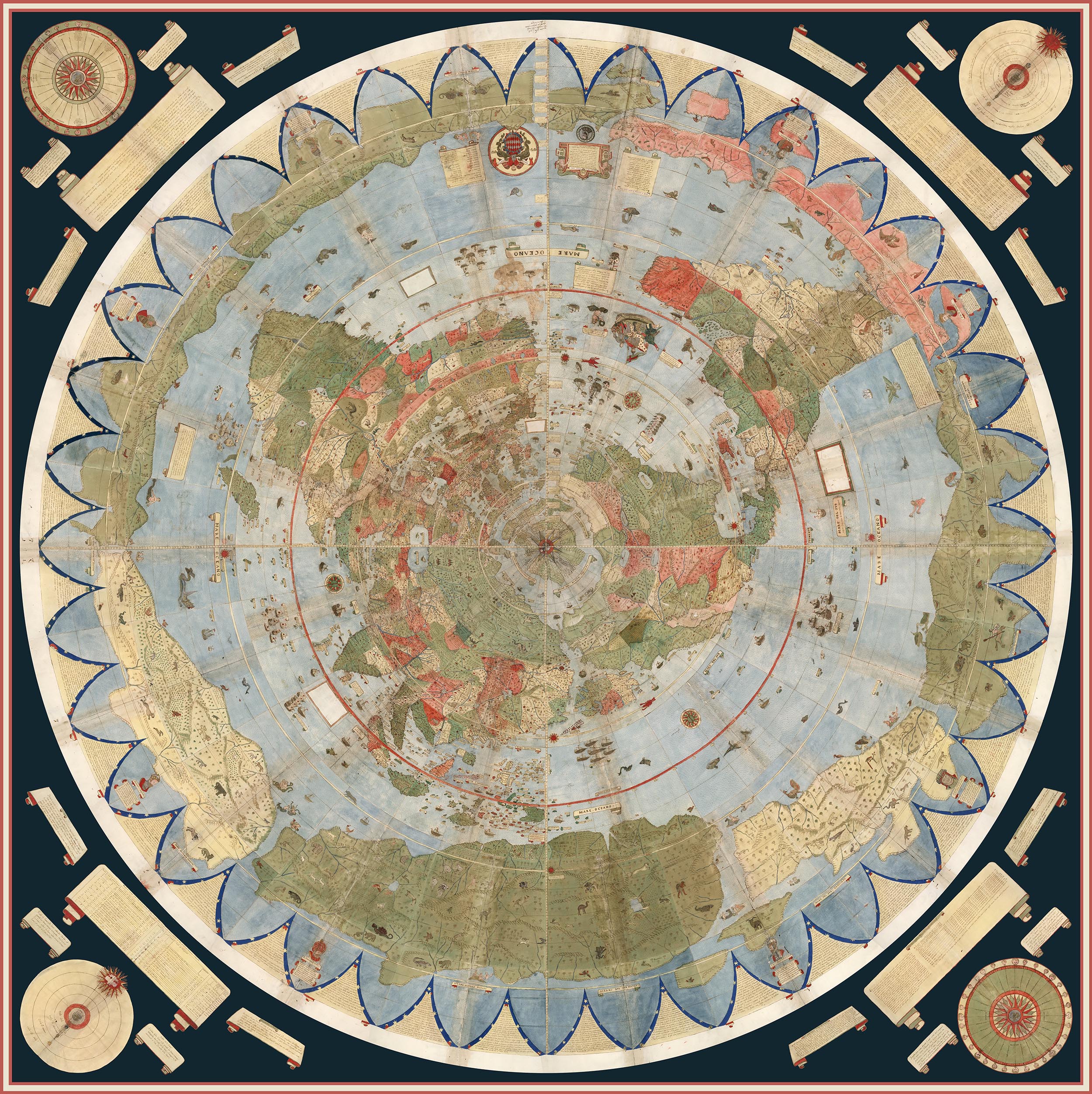
Urbano Monte of Milan, Italy, made his hand drawn map of the world from 66 sheets that when joined created a world map 10 feet in diameter. Monte never was able to assemble his map but we have been able to do so using digital scans of the sheets below.
Monte's dream is realized in this digital composite map of all his sheets. Monte intended his assembled map to be hung on a wall with a peg in the center allowing it to be rotated around so that all parts of the map could be viewed up close. We accomplish this digitally.
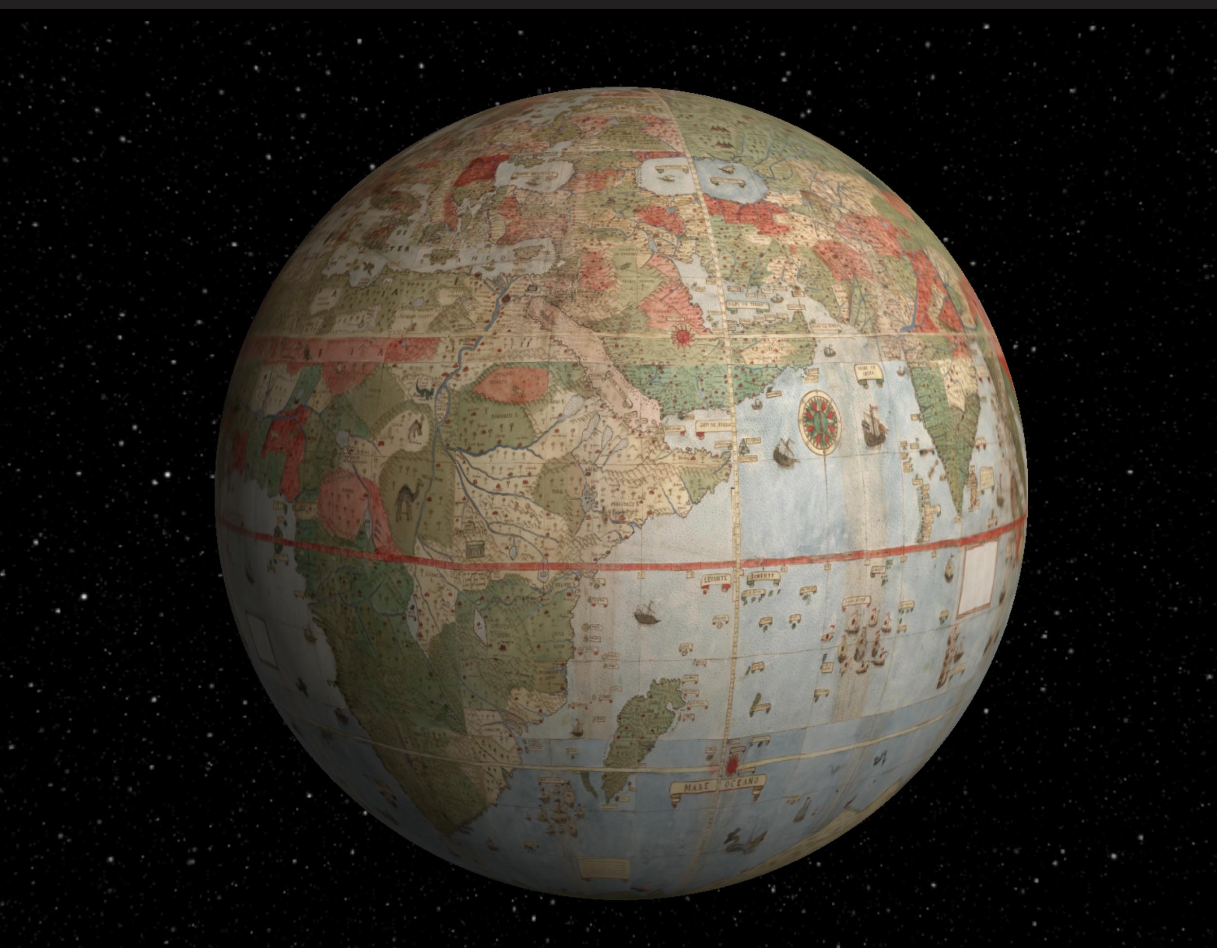
We georeferenced Urbano Monte's flat map and reprojected it as a globe.
From these examples, it can be seen that repurposing, georeferencing, compositing, and other manipulations allowed by the digital nature of our facsimiles can give us much greater understanding of the original map makers intentions and goals. In addition to the uses shown above, we can use the digital map images as sources of text information. In the coming years we expect to add search capability for any text on our maps by reading and indexing all the words on the maps using powerful software programs. This will greatly expand the searchability of our maps and allow pathways into their content and provide new interpretations in yet other ways from those shown above..
4 Comments on More Than Digital Copies: Maps That Interpret Maps
It's a shame that I cannot add more words to praise all of this work. Spectacular!
What a wonderful collection. I could spend weeks examining each map in detail. Many, many thanks.
Talk about serendipity! I received this email just in time to use it as a visual reference/inspiration for a mapping project that art students in my spring semester classes will be working on at the School of the Art Institute of Chicago. I can only echo the other commenters words of appreciation, wonder and gratitude. Bravo!



I received your email about this blog today and I think your work is mind-blowing. As a 'little old lady' who's used one of your maps in genealogy research towards a series of Family History book I was very excited to have found your website, but this is a whole other level of cartography. What would my lovely geography teachers of fifty years ago have said, never mind the original cartographers? My favourite is Vincenzo Coronelli's. I hope someone makes his globe up one day so that we really can walk inside it.